Marketing
13 Product Photography Ideas You Can Make From One Photo
Product photography ideas for small businesses: 13 product shot styles, from studio backdrops and flat lays to splashes and levitation, each with real examples.
· Dex
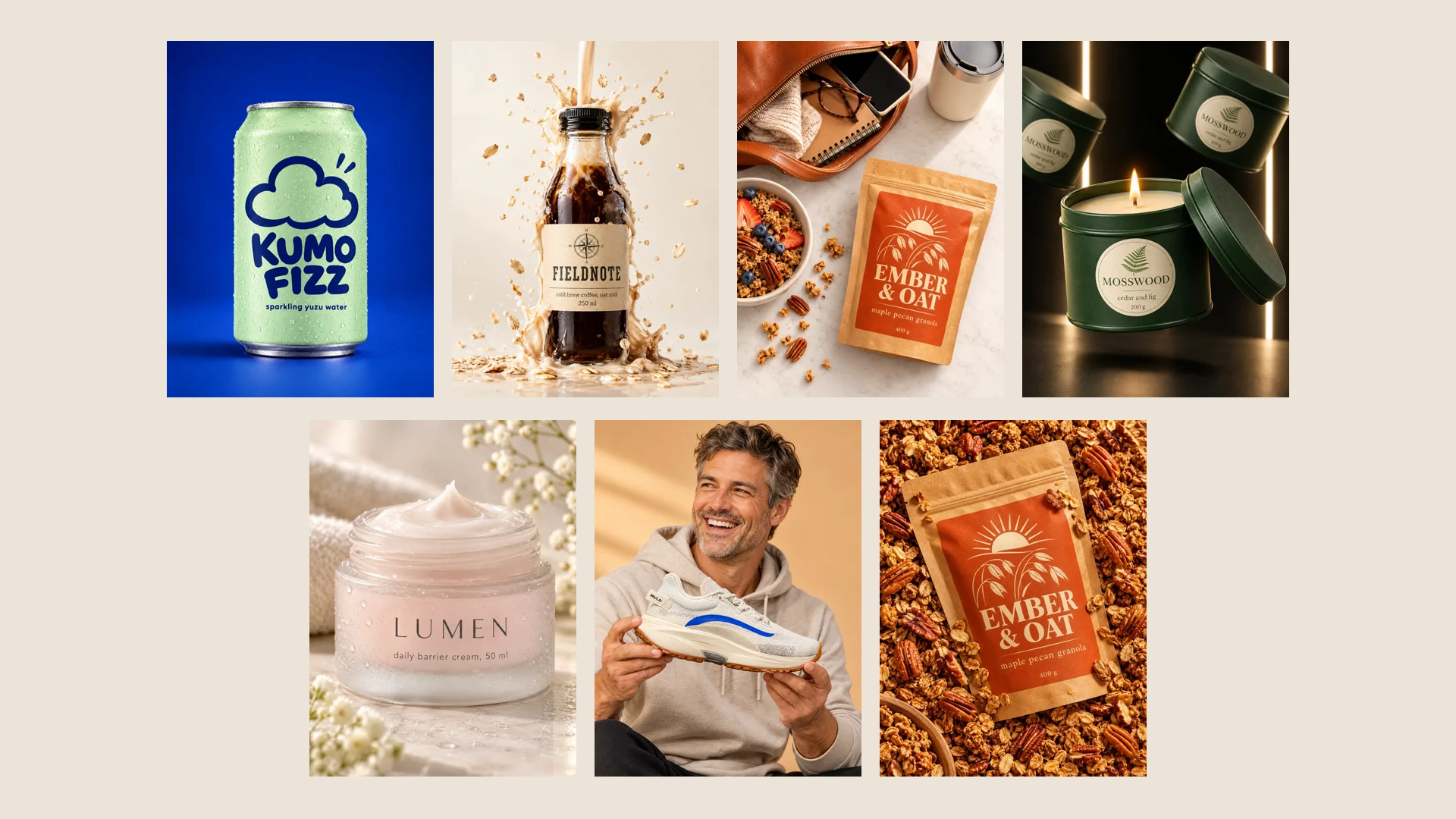
Good product photography ideas are easy to find. Pulling them off is the hard part: every new look usually means new props, a new set and another afternoon of shooting. This list takes a different route. Each of the 13 ideas below is shown as a finished image, and each one was made by a product shot template in Kubeez Marketing Studio from a single photo of the product.
The brands you will see (Fieldnote cold brew, Kumo Fizz, Ember & Oat, Lumen, Mosswood and Rivlo) are fictional sample products made for the template previews. Under every idea there is a link that opens the studio with that template already picked, so you can try the same look on your own product.
Clean sets that sell the product itself
1. A quiet studio backdrop
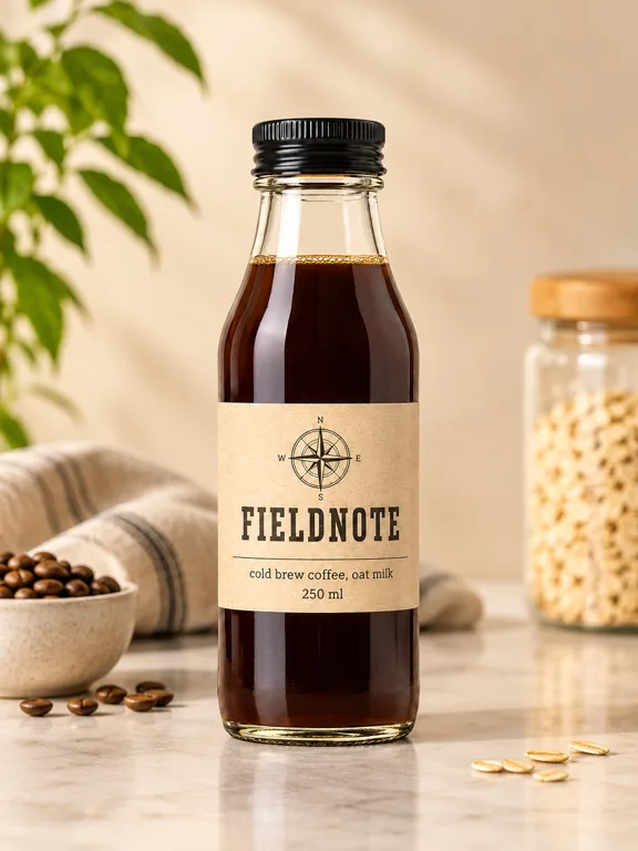
The safest product shot there is: one product, a calm surface, a couple of quiet props that hint at what is inside. Quiet Solo works as the first image on a product page and as the base for ads.
When to use it: store pages, catalogues, anywhere the product has to be read in a second. Try 1:1 or 3:4.
2. One bold opposite color
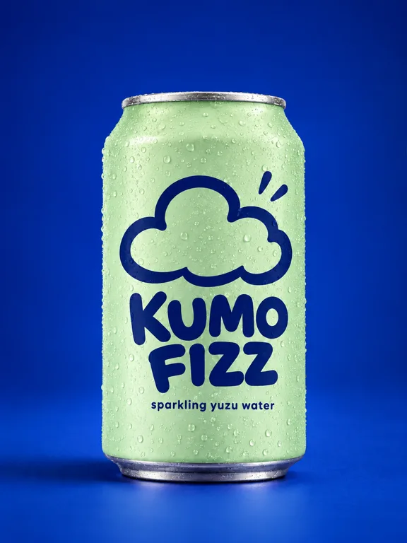
Put the product on the color opposite its packaging and it jumps off the screen. Opposite Colour does exactly that with a pale green can on deep blue.
When to use it: feed posts and thumbnails that compete with busy timelines. 1:1 or 9:16.
3. A podium for the whole range
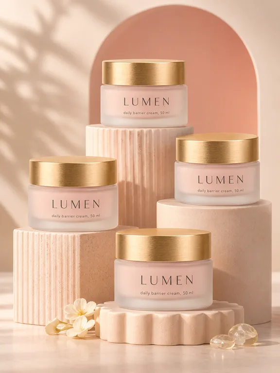
Stacked plinths turn one jar into a collection and give the set some architecture. Podium Cluster is a good fit for beauty, fragrance and anything sold in sizes or variants.
When to use it: launch posts, collection pages, banners. 4:3 or 16:9 if you need room for a headline later.
Flat lays and still lifes
4. The "what's in my bag" flat lay
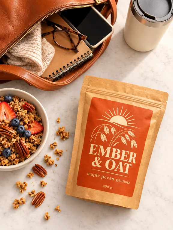
Shoot from above and surround the product with the things your customer carries on the same day. Bag Spill Flat Lay tells you who the granola is for without a word of copy.
When to use it: social posts, blog headers, email. 1:1 or 4:3.
5. A bed of ingredients
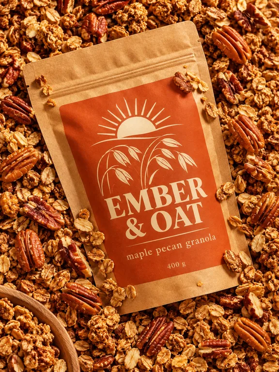
Fill the whole frame with what the product is made of. Ingredient Bed works for food, coffee, tea, skincare with a hero ingredient, even candles with a scent note.
When to use it: product pages and ads that lead with "made from". 3:4 or 1:1.
6. A seasonal setting
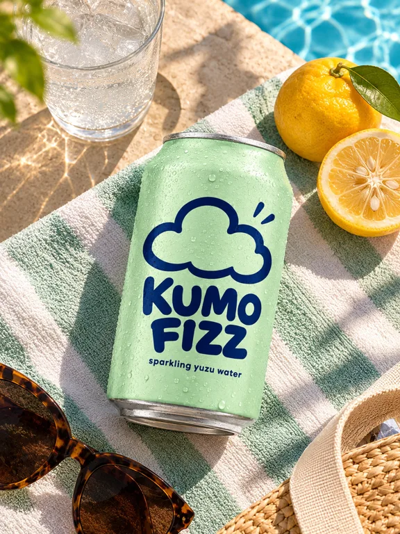
Place the product where it belongs in a season: a poolside towel in summer, a wool blanket in winter. Sunlit Setting does summer. Add a line in the optional Details box, such as "winter cabin, warm light", to steer the scene.
When to use it: seasonal campaigns and holiday sales. 9:16 for stories, 1:1 for the feed.
Light and mood
7. Dappled sunlight and leaf shadows
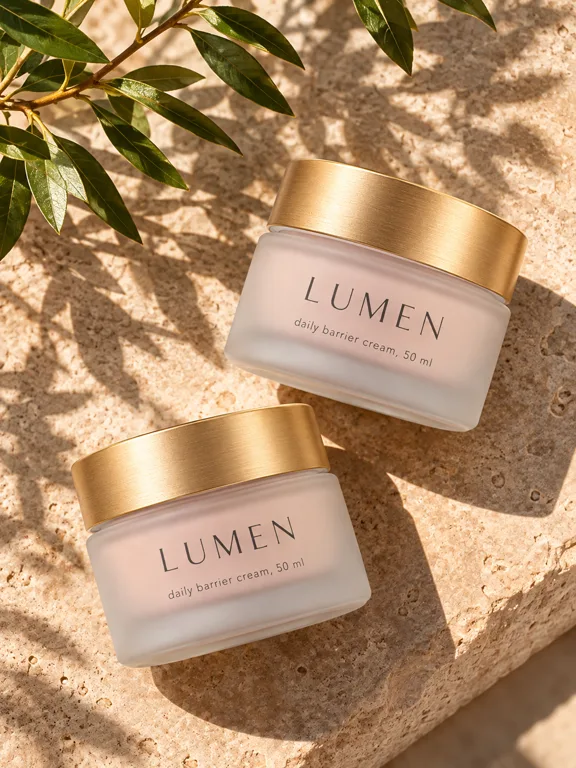
Hard sunlight through leaves makes a simple surface feel like a place. Dappled Stone is the look behind a lot of natural skincare and wellness brands.
When to use it: brand feeds that want warmth without people in frame. 3:4.
8. A moody dark set
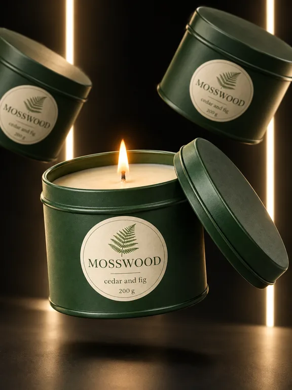
Dark sets make premium products feel more premium. Strip Light Void uses a black room and two light strips, and lets one lit candle carry the shot.
When to use it: evening products, gifting, premium lines. 9:16 or 3:4.
Motion frozen in a still
9. A splash
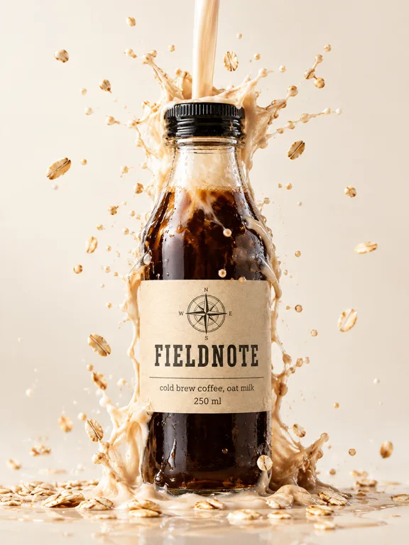
Splashes are the classic drinks shot because they show freshness and texture at once, and they are the hardest to get right on a real set. Splash Crown freezes milk and oats mid air around the bottle.
When to use it: drinks, sauces, skincare. 3:4 or 9:16.
10. Levitation
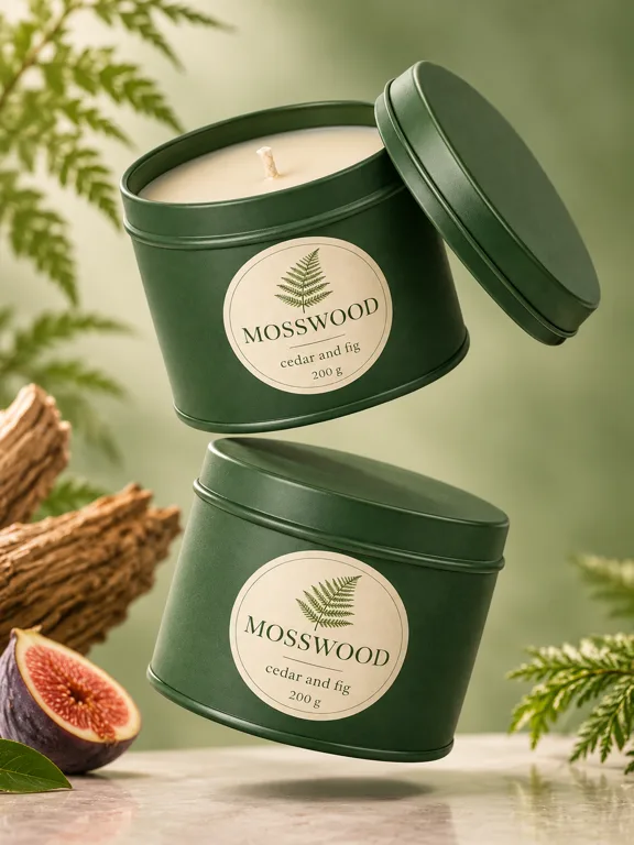
A product in mid air reads as light, new and a bit playful. Floating Tower stacks two tins with the lid lifted, so you see inside the product too.
When to use it: launches and "new" posts. 3:4.
11. A macro on texture
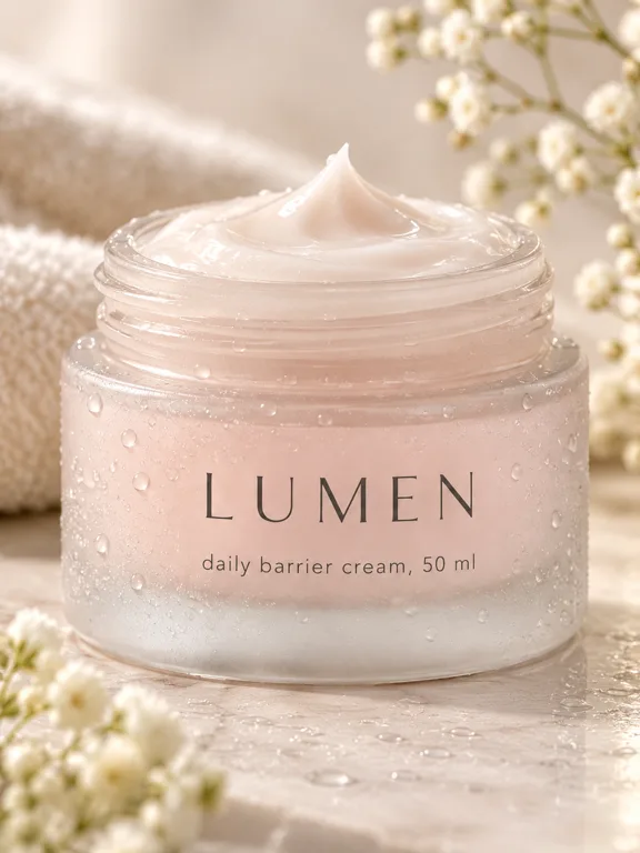
Get close enough that the texture is the subject. Cap Off takes the lid away and shows the cream. Macro shots answer the question shoppers cannot ask through a screen: what does it feel like?
When to use it: the second or third image on a product page, and detail posts. 1:1 or 3:4.
People and use
12. The product in use
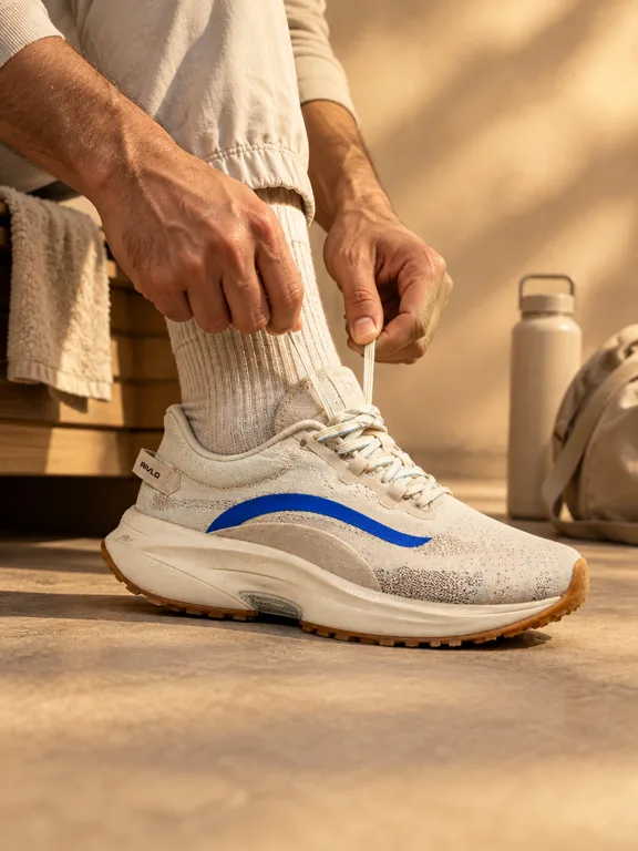
Show the moment the product starts doing its job. Color Room catches the sneaker being laced in a room toned to match it.
When to use it: product pages and ads where use is the selling point. 3:4 or 4:3.
13. Someone holding it

A face next to the product adds scale and a feeling in one frame. Laugh Mid Use keeps it relaxed rather than posed.
When to use it: social posts and the lifestyle slot of a listing. 3:4 or 9:16.
How to get these looks for your own product
You do not need a set for any of these. You need one clear photo of the product, a name and a short description. Then:
- Save the product in Marketing Studio.
- Open Choose a template and browse the product shot shelf, which holds hundreds of looks beyond these 13.
- Pick the aspect ratio (1:1, 3:4, 9:16, 4:3 or 16:9), the resolution (1K, 2K or 4K) and how many images to make, 1 to 4.
- Generate, keep the takes you like, and press Use this template to repeat the look on another product.
The full walkthrough is in the School lesson on making product ads and videos with AI. If you want to know how far AI product photos can go, read AI product photography. And to see one photo turned into ads, posters, listing images and videos as well, see one product photo, a full marketing asset pack.
Shots without copy are only one shelf. For listing layouts with callouts, see product listing image ideas; for headlines and offers, see product ad ideas.
FAQ
What are good product photography ideas for a small business?
Start with one clean shot on a quiet backdrop, then add a detail shot, one in context (a flat lay, an ingredient bed or a seasonal setting) and one with a person using the product. That mix covers a product page and a month of posts.
What background is best for product photos?
A calm neutral backdrop for the main image, because it lets the product read instantly. For social, a bold color opposite your packaging stands out more.
Can I make product photos without a photoshoot?
You need one clear, well lit photo of the real product, with the whole product in frame and the label facing the camera. From that photo, each template builds the scene, the light and the props.
Which aspect ratio should product photos be?
1:1 and 3:4 suit most store pages and feeds, 9:16 suits stories and full screen placements, and 4:3 or 16:9 suits banners. Check the requirements of the store or marketplace you sell on, since Marketing Studio does not check them for you.
Will the result look exactly like the example?
No. The examples were made on sample products. Your photo, your product and your description change the result, so make one image first and then more of the looks that work.
How much does it cost?
Marketing Studio is credit based, and the Generate button shows the cost before you run it. Plans are on the pricing page.
Try one idea today
Pick the idea closest to your brand, open it with the link under its image, and run it on your own product photo in Kubeez Marketing Studio.
Dex writes the Kubeez guides and makes every example with the same tools you use.