Marketing
12 Product Ad Ideas for Online Stores, With Real Examples
Product ad ideas for online stores: 12 static ad formats, from comparison and before and after to launch posters, each shown with a real example you can reuse.
· Dex
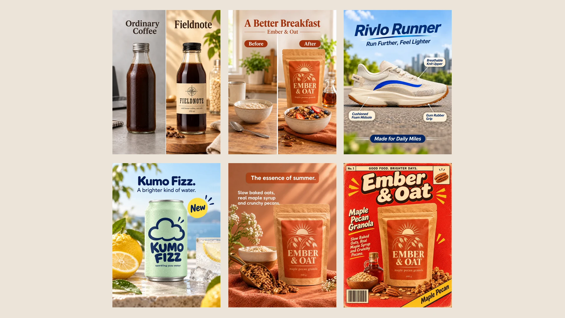
Good product ad ideas are mostly good formats. A comparison, a before and after, three numbered steps: each one answers a question a shopper already has, and each one can be rebuilt for any product. This post walks through 12 static ad formats that work for online stores, with a finished example of each.
Every example below was made in Kubeez Marketing Studio by an Ads or Posters template, from one photo of a sample product. Fieldnote, Lumen, Rivlo, Ember & Oat, Kumo Fizz and Mosswood are fictional brands made for the template previews. Under each one is a link that opens the studio with that template picked, so you can run the same format on your own product photo. If you want the full set of formats from one photo, including video, start with the pillar guide on turning one product photo into a full marketing asset pack.
1. The comparison ad
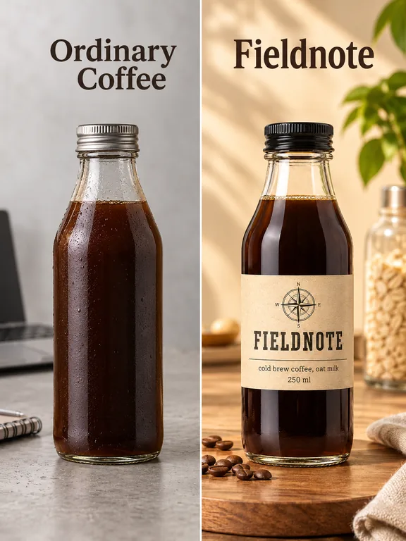
Put your product next to the generic alternative and let the difference do the talking. It works best when the difference is visible: packaging, ingredients, texture. Use the Comparison template.
Tip: compare against a category ("ordinary coffee"), not a named competitor.
2. Problem to solution
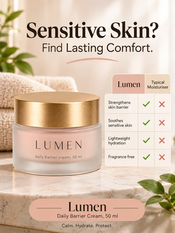
Name the problem in the headline, then show the product as the answer. Shoppers who have the problem recognise themselves in the first line. Use the Problem to Solution template.
Tip: write the problem in your customer's words in the product description; the ad can only state what you wrote there.
3. Before and after
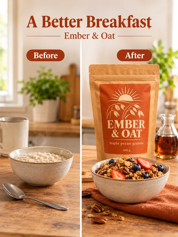
Two panels, one change. It suits anything with a visible result: a breakfast, a tidy shelf, a clean shoe. Use the Before and After template.
Tip: keep the "before" honest and ordinary. An exaggerated before makes the whole ad less believable.
4. Benefit callouts
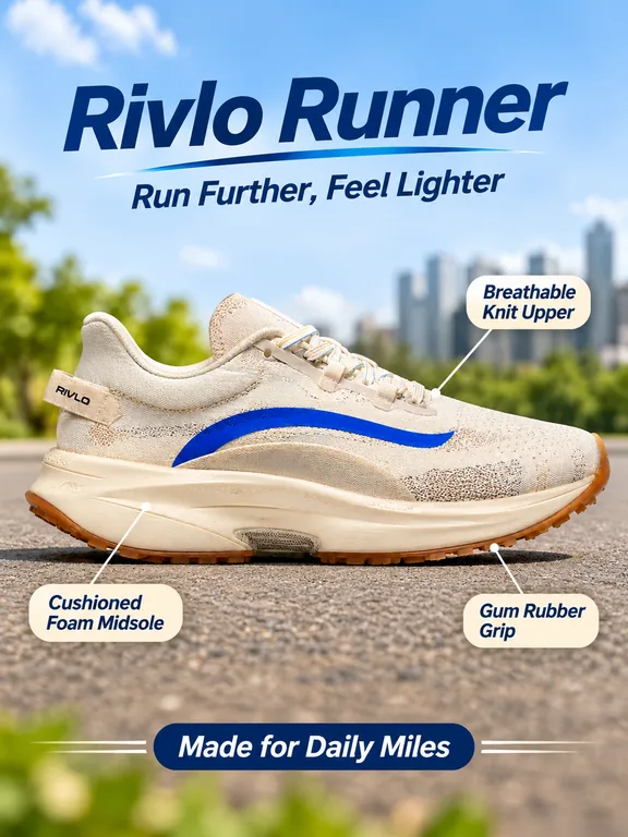
Lines from the product to short labels, one per feature. It turns a spec sheet into something a thumb stops for. Use the Benefit callouts template.
Tip: three or four callouts is plenty. Put the feature list in the product description and the template picks from it.
5. The bold headline
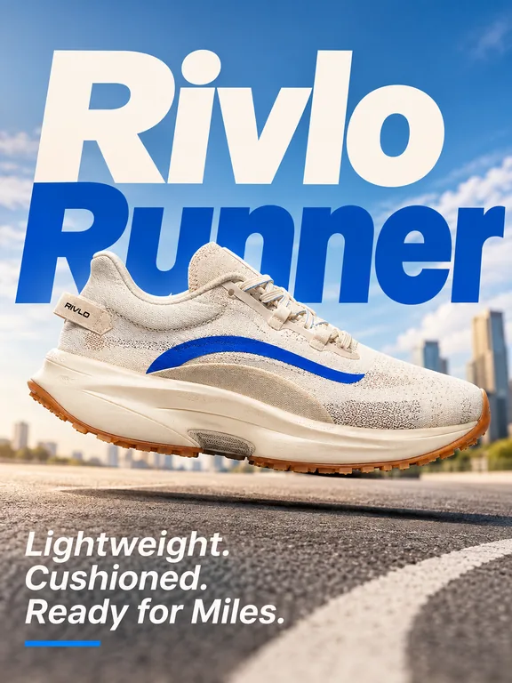
Huge type, one product, a short line underneath. It is the simplest ad there is, and it works when the name or the promise is strong on its own. Use the Bold headline template.
Tip: run it in 9:16 for stories, where the big type fills the screen.
6. The launch ad
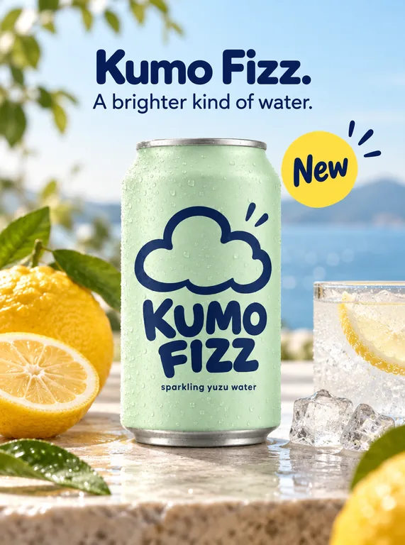
A clean hero shot, the tagline and a "New" badge. Use it for a new product, a new flavour or a restock. Use the Launch template.
Tip: pair it with a poster (idea 12) for the same launch, so the feed gets a calm version and a loud one.
7. Three steps
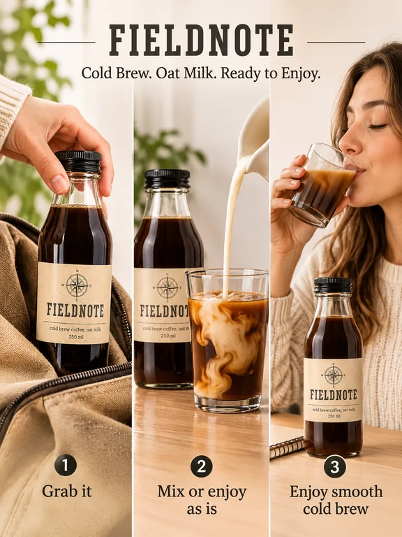
How it works, in three numbered panels. Great for anything that needs a moment of explanation: mixes, kits, routines, devices. Use the 3 steps template.
Tip: if the steps matter, list them in the description so the ad uses yours.
8. What's inside
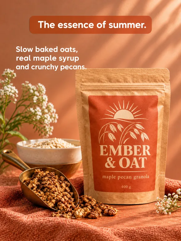
Show the ingredients or components next to the product. Food, skincare and candles sell on what goes into them. Use the What's inside template.
Tip: only list ingredients that are actually in the product; the ad follows your description word for word.
9. The notes app ad
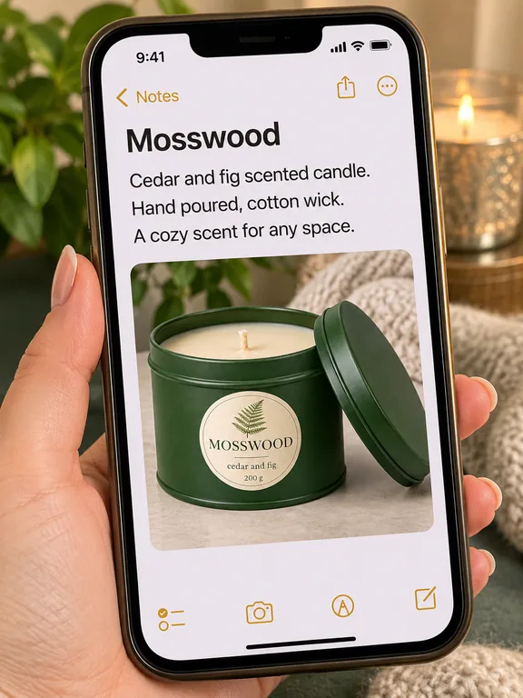
An ad that looks like a personal note on a phone. It blends into a feed full of screenshots and reads like a recommendation rather than a banner. Use the Notes app template.
Tip: keep the description plain and conversational for this one; polished slogans look odd in a note.
10. Use case toggles
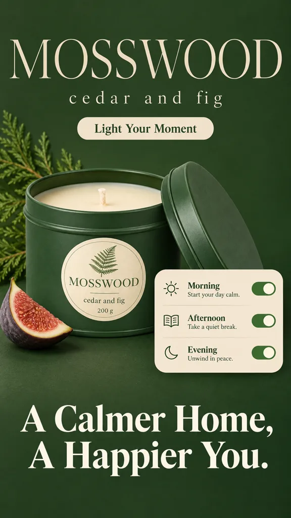
Each toggle is a moment the product fits into. It sells the habit, not just the object. Use the Routine Toggles template.
Tip: this template defaults to 9:16, which makes it a natural story ad.
11. The question hook
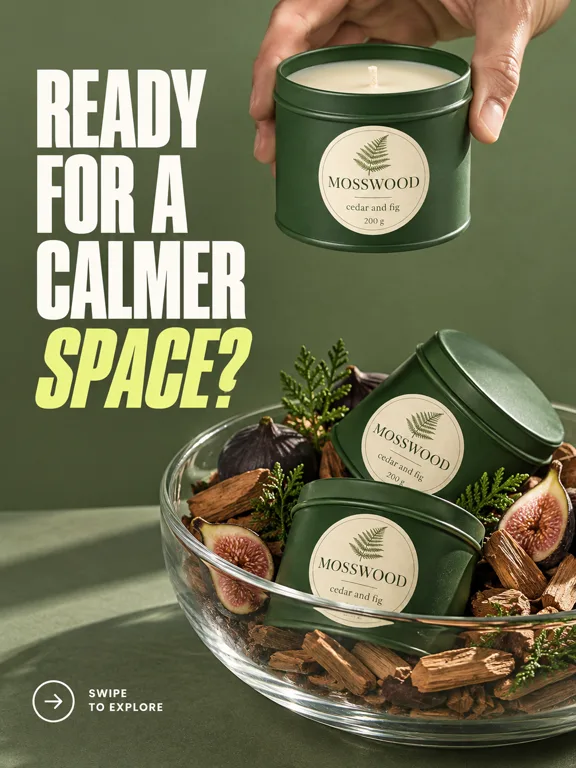
Open with a question the shopper answers "yes" to in their head. It works as a first line in a carousel or as a single feed ad. Use the Question Hook template.
Tip: test it against the bold headline (idea 5): same product, same week, different first line.
12. The launch poster
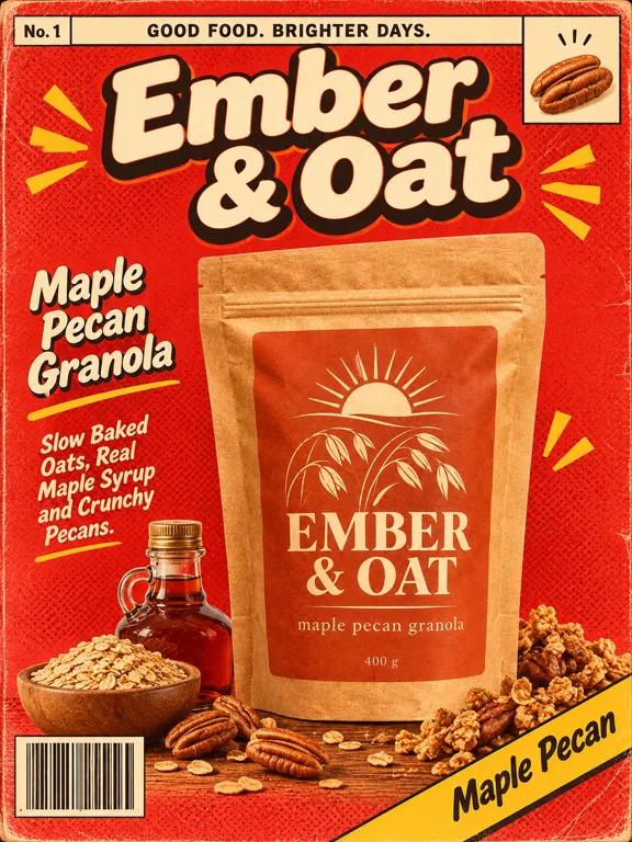
Posters are louder than ads: illustration, big lettering, a strong style. Use them for launches, in-store prints and feed posts that need to stand out. Use the Comic Cover template, or browse the poster shelf for risograph, collage, clay and type-only styles.
Make the ideas your own
The formats are the reusable part. To run them on your product:
- Save the product in Marketing Studio with a clear photo, its name and a description of what it is, who it is for and what makes it good. Ads only say what you write there.
- Add a brand kit so every ad uses your logo, colors, fonts, tagline and language. You can keep up to 5 kits, built from a website or by hand.
- Pick a format from the ads shelf or the poster shelf, set the aspect ratio (1:1, 3:4, 9:16, 4:3 or 16:9) and resolution (1K, 2K or 4K), and make 1 to 4 versions.
The School lesson walks through every setting. For the thinking behind what makes an ad work, see AI ad creatives that convert.
FAQ
What are good product ad ideas for a small online store?
Start with formats that answer a buyer's question: a comparison (why this one), benefit callouts (what it does), what's inside (what it is made of) and three steps (how to use it). They need no lifestyle shoot and work for most products.
Which ad format works best for a new product launch?
A clean launch ad with a "New" badge for the main feed, plus a louder poster for the same launch. Running both gives you two looks to compare in the first week.
What size should a static product ad be?
It depends on the placement. 9:16 fills a story screen, 3:4 and 1:1 suit the main feed, and 16:9 fits wide banners. Marketing Studio makes any of the five ratios from the same template.
Do static image ads still work next to video?
They do a different job. A static ad is read in a second and is cheap to vary, which makes it good for testing headlines and formats. Many stores run both; see the sibling post on UGC video ad ideas for the video side.
How many versions of one ad should I make?
Enough to compare real differences: two or three formats, each with one or two versions. Each run in Marketing Studio makes 1 to 4 images, and each image is its own take on the template.
Can I make product ads without a designer?
Yes. Pick a template, choose your product photo and generate. There is no prompt to write and no layout to build. It is credit based, and the Generate button shows the cost before you run it; plans are on the pricing page. Marketing Studio does not publish ads; you download them and upload them to your ad platform.
Try the formats on your product
Open Marketing Studio, save your product and run two formats from this list. For listing images that sit on the product page itself, see product listing image ideas.
Dex writes the Kubeez guides and makes every example with the same tools you use.